The purpose of our Media Production:
Music Video - To accompany and promote the song, as well as to increase sales of the track.
CD Digipack - To attract the target audience into purchasing the single.
Magazine Advert - To promote the track awareness to target market as well as publicise to release of the track.
There are a variety of different conventions used in music promos, but they depend on factors such as the genre as certain elements you see in R&B music videos will vary to Metal music videos. This is why we had to be cautious when picking and Hip-Hop/ R&B track due to many elements being difficult to present without being to cheesy or unconventional.

Before we started to plan for our Media Production we had to identify direct links in the lyrics that we could use in our production as a common element of music videos have sections where the lyrics relate into the music video. We had deconstructed the lyrics to help us identify what section of the lyrics we could use in the performance that had a relevance to the music video.
There has been a range of professional productions that have influenced our promo, and numerous elements used in these production that have inspired us with certain shots, locations and costumes.
Rizzle Kicks – Down With the Trumpets http://www.youtube.com/watch?v=8ip8OsExLJs
This music promo from Rizzle Kicks has influenced us from numerous shots used; constant use of mid shots and close up shots are used to show the artist singing relating to the theory of Andrew Godwin.” Relationships are built between these in the video, and the close-ups of the artists give them the representation and publicity they require”. The choice of location also had an influence on our production as many music videos of this genre are in city locations or in urban areas. This influenced us to chose a location in a busy town centre and streets with graffiti and a urban feel to them the make sure the video wasn’t located in a rural area affecting the vibe. The constant use of shots lasting up to 5 seconds to keep the audience entertained was also something we considered when editing our production. We didn’t want the shots to drag on for too long so we made sure each shot was under 10 seconds. In the video we see the protagonist carrying a ‘boom box’ to present the element of old school Hip-Hop into their video which inspired us to also incorporate something similar in our video. The clothing used is casual street wear which we decided to copy as it fitted into the vibe of out track. We felt conventional Hip-Hop clothing such as designer labels and heavy jewellery wouldn’t flow well with our production as the song is very chilled out and not a typical Hip-Hop song that has constant reference to wealth and having a wild lifestyle.


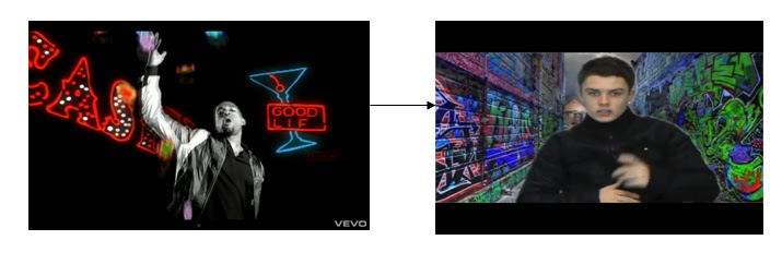
Kanye West ft. T-Pain – Good Life - http://www.youtube.com/watch?v=FEKEjpTzB0Q
The elements that have influenced us in this music video are the direct links with the lyrics and the video. In the song Kanye West refers to various American cities and then in the background we see these cities appear. This inspired us in our decision to use ‘Green Screen’ as we could not shot numerous iconic locations around the UK
Throughout the video the main shot types are mid shots and long shots when there is a big Mise-en-scene. This also influenced our decision to revolve our shot types around these two shots but to add various effects such as the ones used in Kanye West’s music video. The effects work so well due to the picture being in greyscale but the effects being used are bright colours. This is something that has influenced us as it helps to contrast the text from the background.

In the majority of music videos of the Hip-Hop genre there are common links between the lyrics of the song and the video in the narrative parts of the video. So before planning the music video possible links had to be identified, so this conventional links between the lyrics and video could be made. You can see how we deconstructed the lyrics of our track “Wherever” to benefit us when planning the narrative scenes for our video. This relates to Andrew Godwin’s theory of relating the lyrics to the music video.
 - A relationship between the lyrics and the visuals, with the visuals illustrating, amplifying or contradicting the lyrics.
- A relationship between the music and the visuals, with the visuals illustrating, amplifying or contradicting the music.
- Genre-related style and iconography present.
- Multiple close-ups of the main artist or vocalist

When creating our Digipack we where inspired by media that influenced on certain elements we decided to use on our Digipack. We made sure we used common elements used on normal Digipack but we wanted it to relate to the genre of our track so we researched into other Digipack from other similar artists.

These two Digipack influenced our decision in making our album covers very basic but adding effects to them using Photoshop. We were influenced by the idea of using a simple street or building then adding effects as it was very simple but worked well in contrasting the colours from the background. The two album covers are very different as one is from the Hip-Hop genre and the other is from Alternative/Rock band.


This Magazine advert from Vibe Magazine has influenced our decision to use a plain white background with a font colour of red as it contrasts well making the text stand out. This will appeal to our audience as it is eye catching. The use of a simple font also had an influence on our decision as its clear and very visual also helping the text to stand out.
No comments:
Post a Comment